SEED to TABLE SEED to TABLE
- BRANDING
- LOGO
- GRAPHIC
有機種子を扱う企業、株式会社グリーンフィールドプロジェクト様による新プロジェクト『SEED to TABLE』 のロゴデザインおよびタグライン設計を担当いたしました。
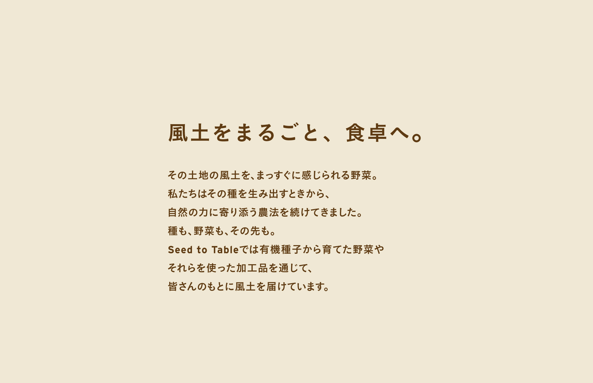
タグライン「風土をまるごと、食卓へ。」には、野菜そのものだけではなく、その土地の土壌や気候、生産者の想い、自然と向き合う時間までも含めて届けたいという願いが込められています。
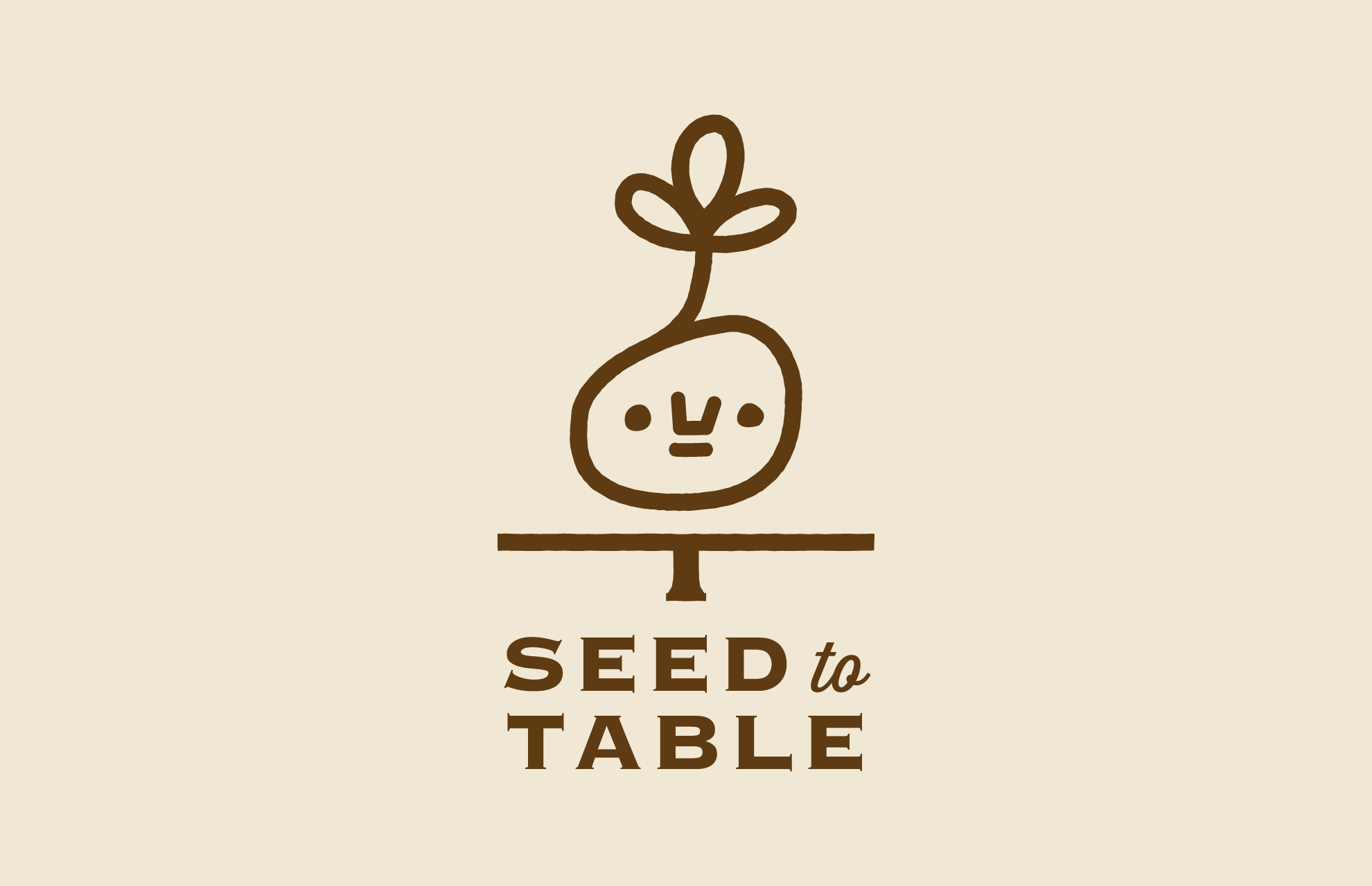
有機種子を扱い続けてきた株式会社グリーンフィールドプロジェクト様だからこそ実現できる、“種からはじまる食の循環”。その思想を、ロゴに落とし込みました。
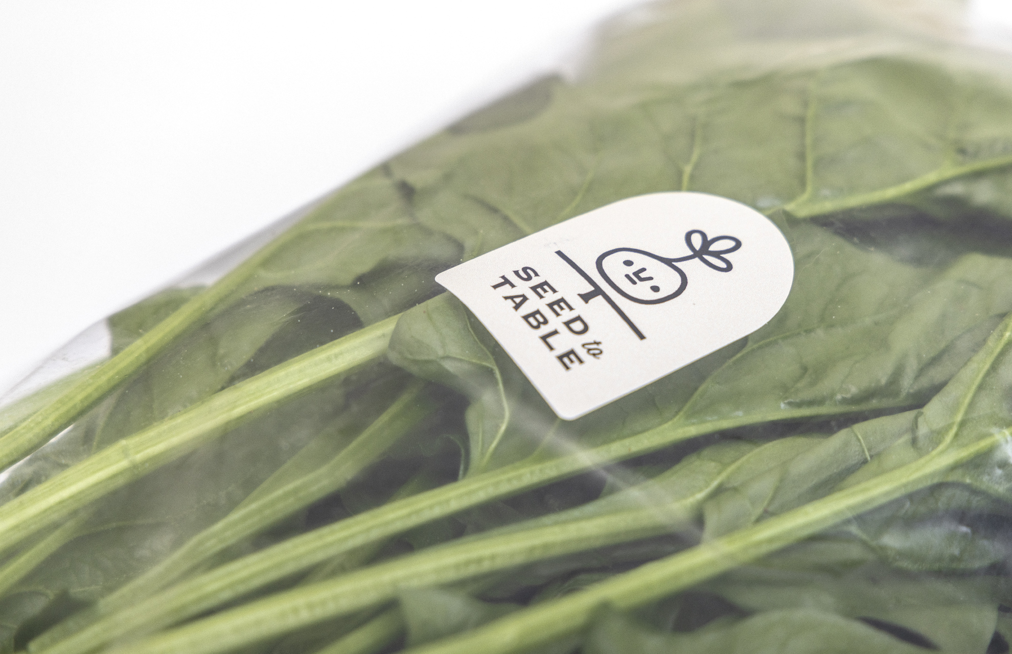
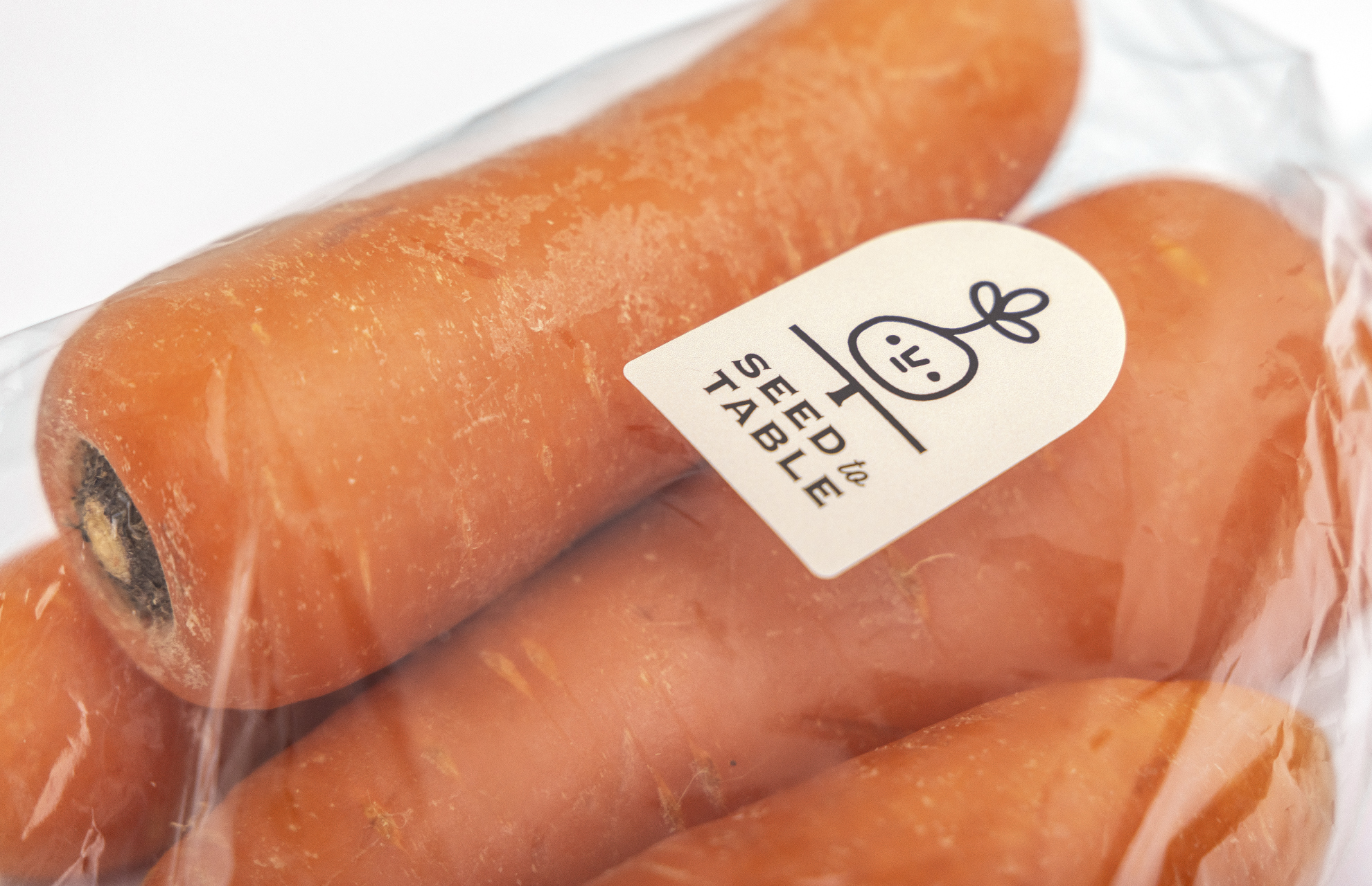
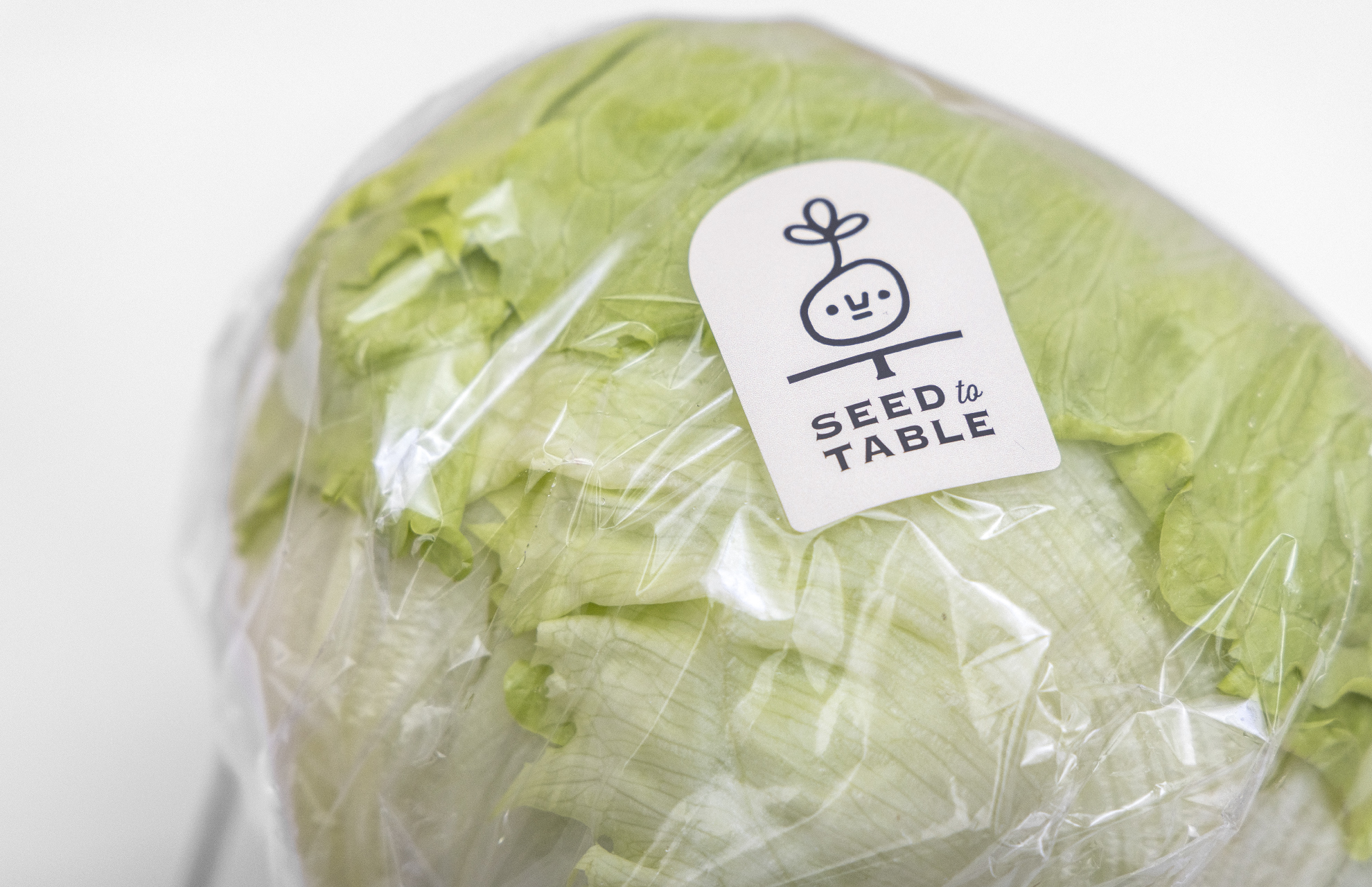
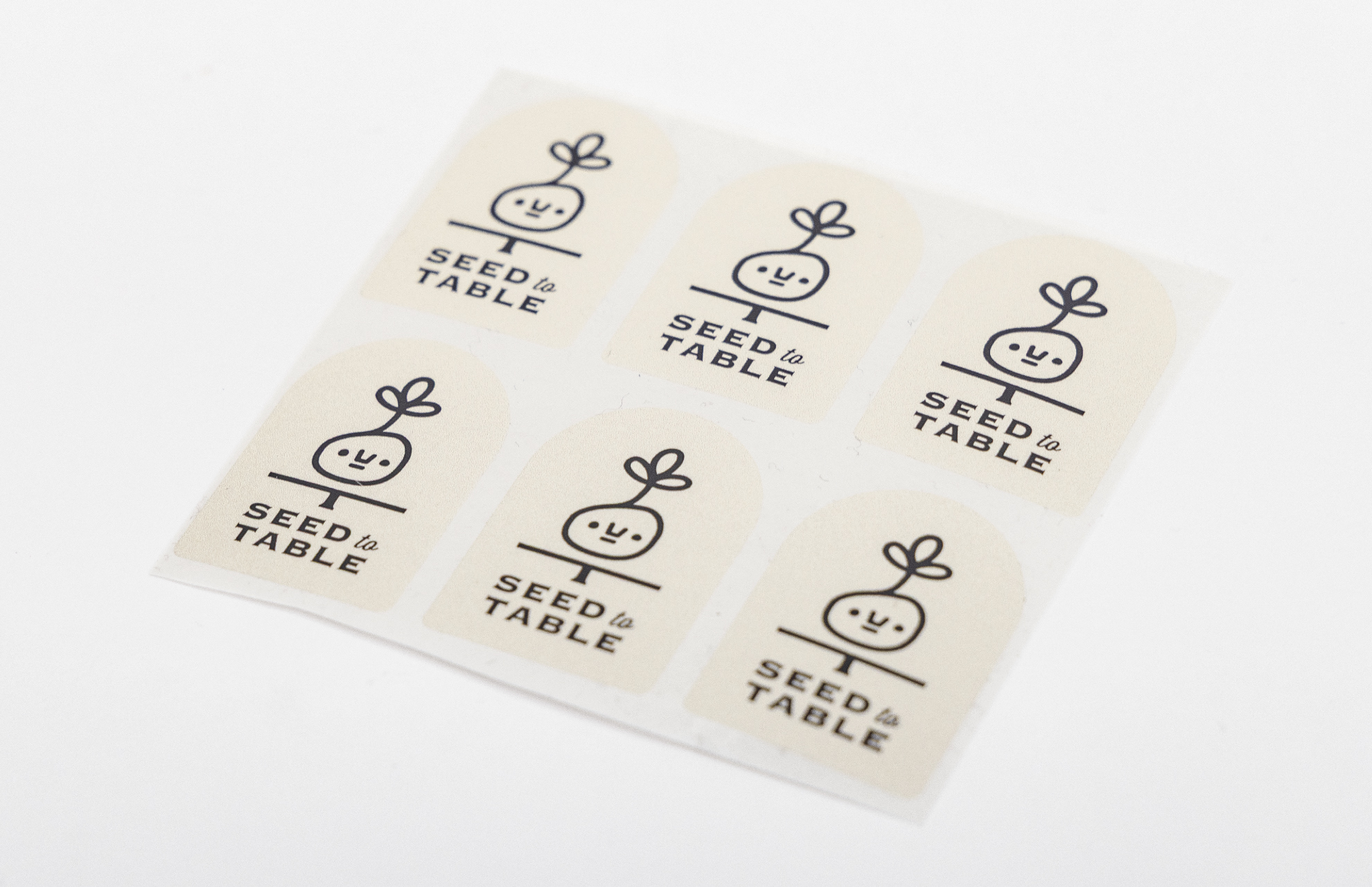
モチーフは、有機の種から芽吹いたキャラクター。種は未来の象徴であり、いのちの起点です。芽吹く瞬間を親しみやすいフォルムで表現することで、有機というテーマをより身近に感じてもらえる存在を目指しました。
ロゴに描かれた水平ラインは、大地と食卓をつなぐ境界であり、橋渡しの象徴。種が風土をまといながら育ち、やがて食卓へ届くまでの物語を視覚的に表現しています。やわらかなブラウンを基調とした色設計は、土のぬくもりや誠実さ、持続可能な取り組みへの姿勢を表しています。
『SEED to TABLE』は、種、野菜、その先の未来までを見つめながら、風土を味わう体験を日常へと届けるプロジェクトです。これから広がっていくこの取り組みを、デザインの力で応援してまいります。
ロゴデザイン:本多り子(asianvoice Inc.)
タグライン&ステートメントコピー:佐々木ののか
Organic seed company Green Field Project Co., Ltd. has launched a new initiative, SEED to TABLE, for which I was responsible for the logo design and tagline development. The tagline, Wind and soil, brought whole to your table, expresses the desire to deliver not only vegetables themselves, but also the soil in which they are grown, the climate that shapes them, the care of the producers, and the time spent in harmony with nature. Only a company that has long specialized in organic seeds, Green Field Project Co., Ltd., can realize a true food cycle that begins with the seed. That philosophy has been carefully translated into the logo design. The central motif is a character sprouting from an organic seed. A seed symbolizes the future and marks the beginning of life. By depicting the moment of germination in a friendly, approachable form, the design aims to make the concept of organic agriculture feel accessible and close to everyday life. The horizontal line in the logo represents both the boundary and the bridge between the earth and the table. It visually conveys the journey of a seed as it absorbs the character of its land, grows, and ultimately reaches the dining table. The soft brown color palette evokes the warmth of soil, sincerity, and a commitment to sustainability. SEED to TABLE is a project that looks beyond seeds and vegetables toward the future they nurture, bringing the experience of tasting terroir into daily life. I am honored to support the continued growth of this initiative through design.
Logo Design: Riko Honda, asianvoice Inc.
Tagline and Statement Copy: Nonoka Sasaki