MEC_医学生用教科書の表紙デザイン MEC
- GRAPHIC
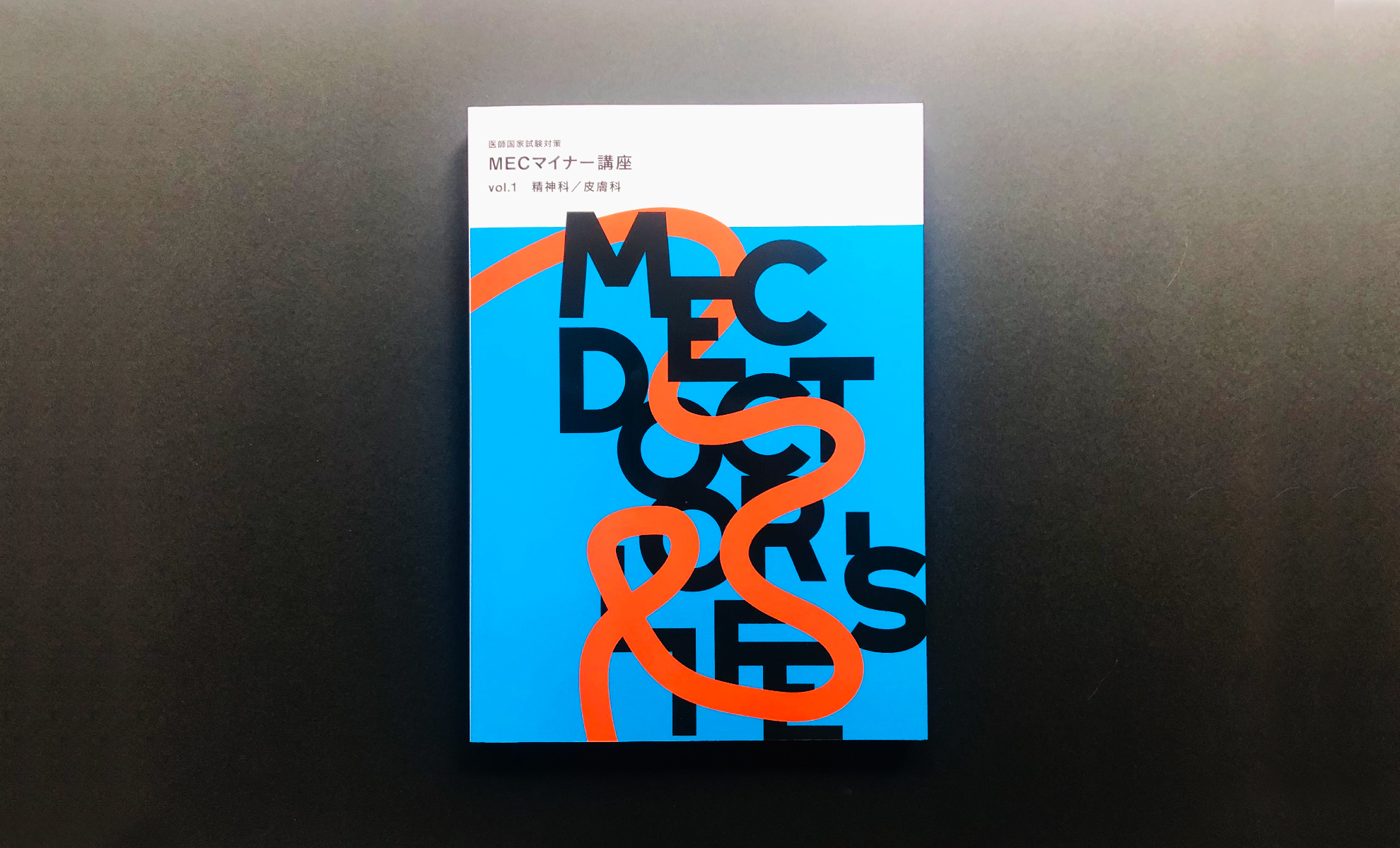
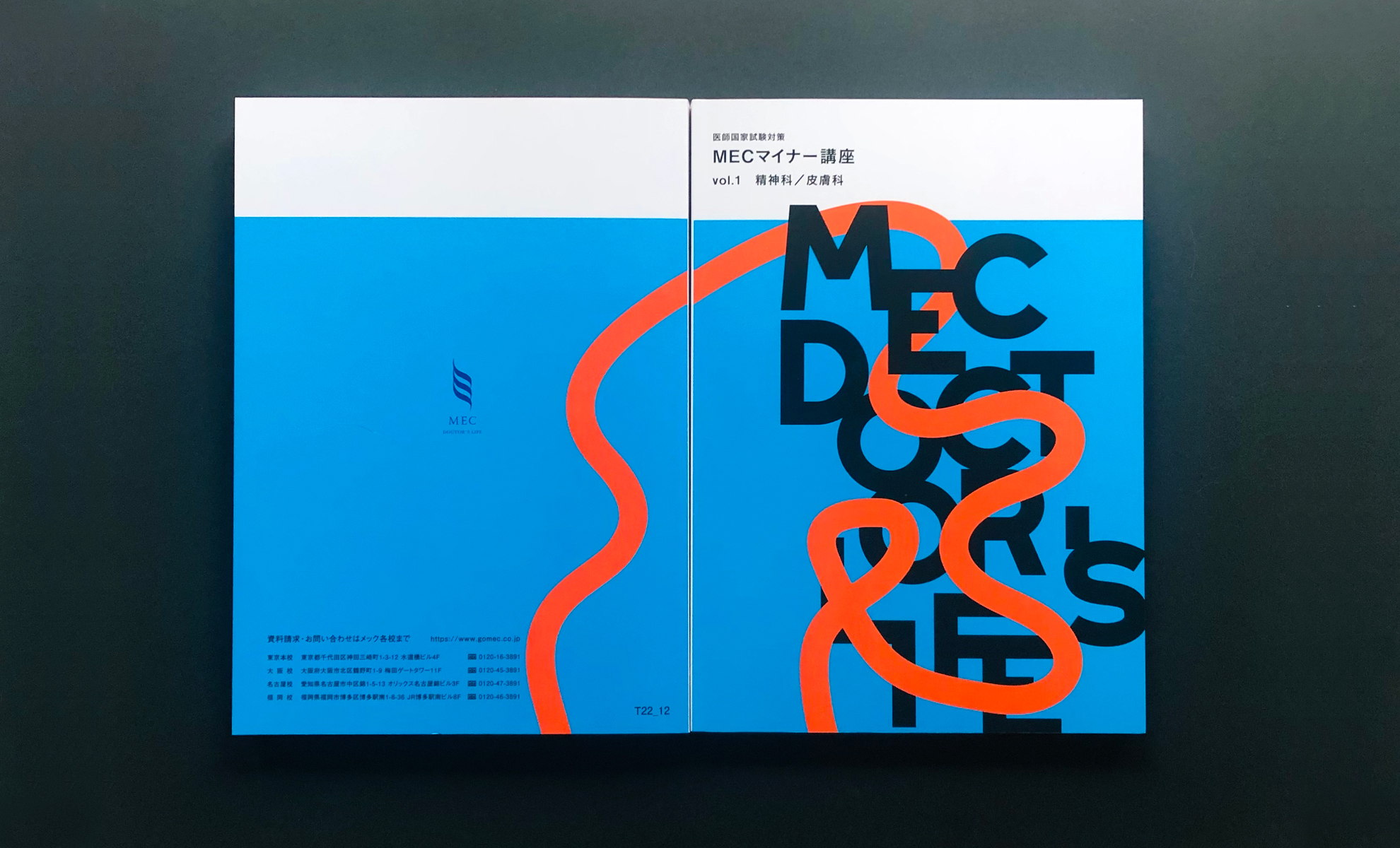
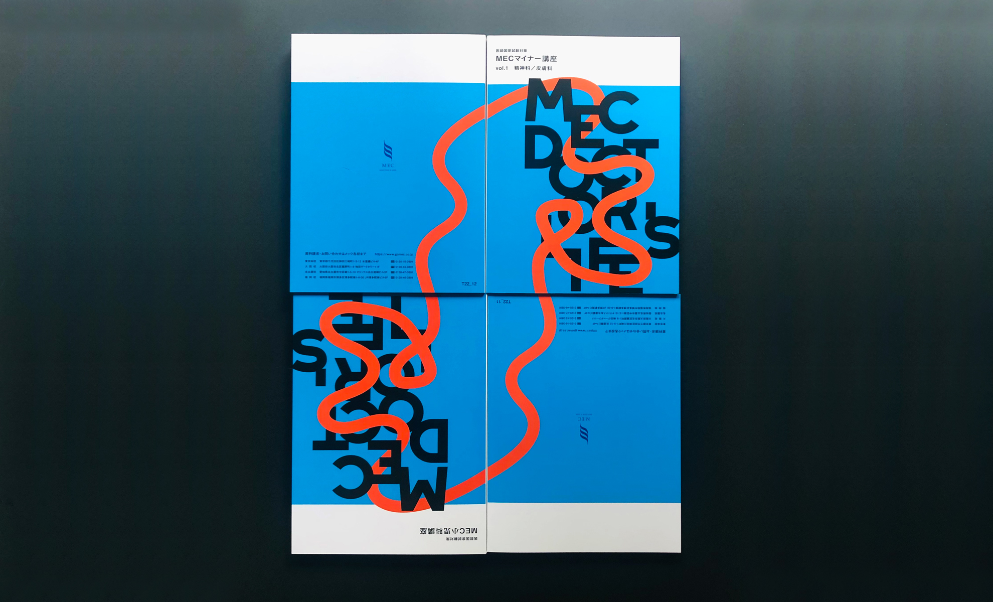
「より良い医師の育成」を医学教育で支援する企業の株式会社メック様からのご依頼で、医大生用の教科書の表紙デザインを担当いたしました。将来の医療を担う医学生の皆さんにエールを贈る気持ちでデザインしました。シンプルでボールドなタイポグラフィに有機的なラインをあしらうことで、医学とは人を対象とした学問であることを表現しています。学生さんが同じ表紙デザインの教科書を数冊持つことがあるとお聞きしたので、このラインは裏面へとつながり、最終的には循環しているようなフォルムに仕立てました。こうすることでラインが血液のようにも見えてきます。この教科書は既に配布が始まっているそうで、ありがたいことに好評を頂いております。
MEC Co., Ltd., a company supports nurturing for better medical experts in medical education requested me to design the cover of their textbook. I worked for this project with the feeling of cheering for medical students who will be responsible for medical care in the future. I designed the common and strong typography intertwined with the organic line. This expresses the medical science is a study for human. I designed the organic line to connect to the back of the textbook from the front and it looks like circulating through the line. In this way the line also looks like vein.The textbook has already been distributed and thankfully it has been receiving a good reputation.