モリサワの新広告「字空便」 MORISAWA advertising series "Jiku-bin"
- GRAPHIC
- EDITORIAL
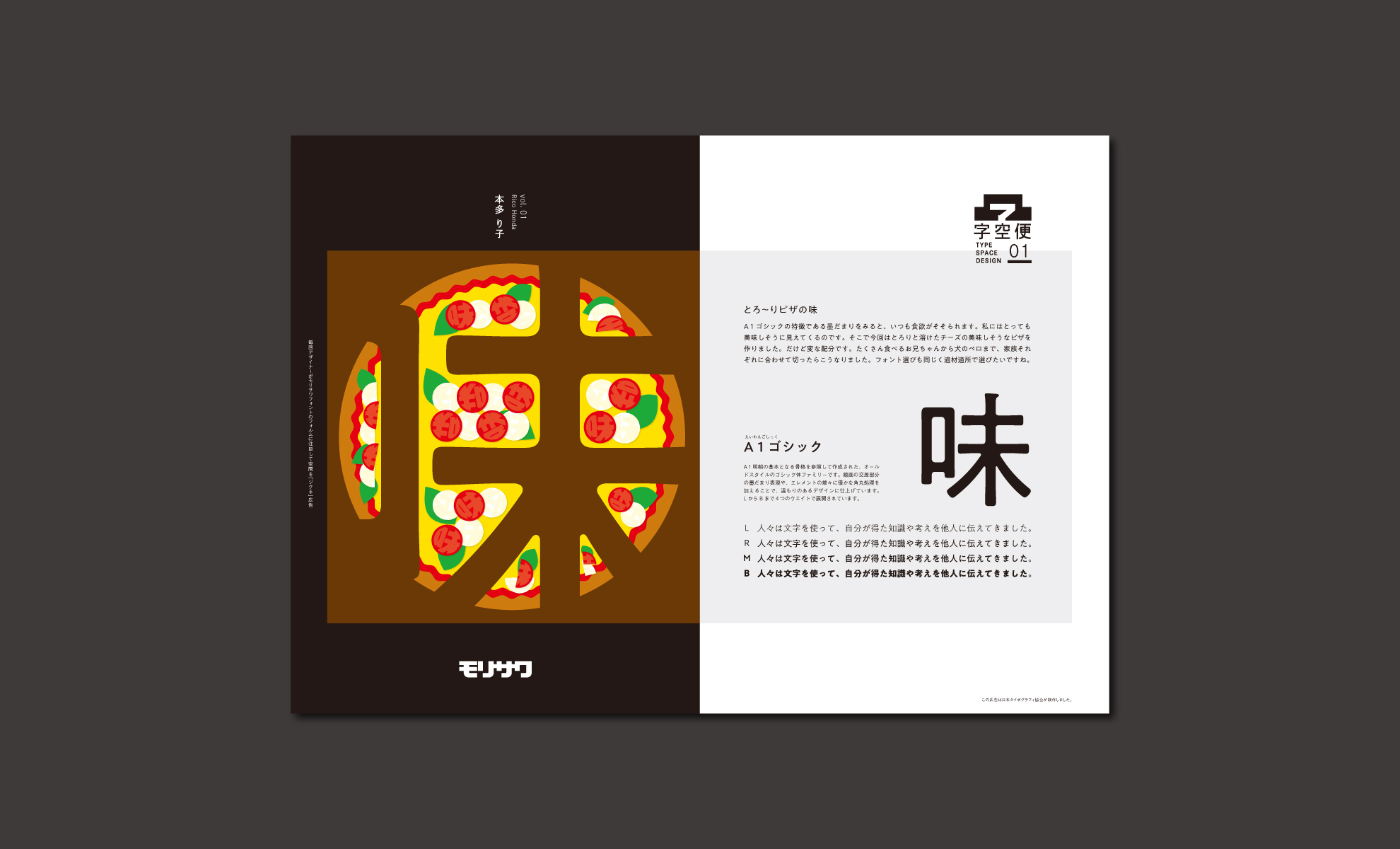
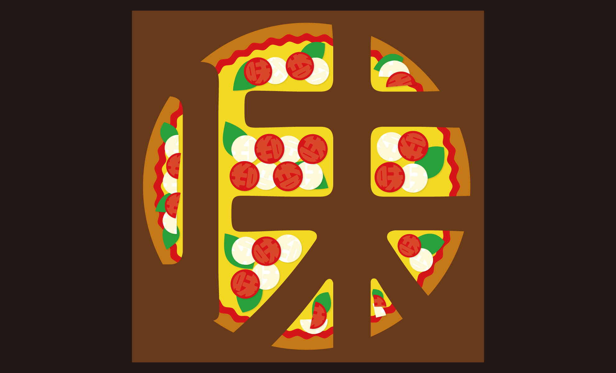
日本語フォントの販売企業モリサワの新広告シリーズ『字空便』の企画と第1回目のデザインを担当させていただきました。NPO法人日本タイポグラフィ協会が発行している『Typographics T』誌に301号から掲載されていきます。『字空便』とは、モリサワフォントを使って、毎回違うデザイナーが、文字の「中」の余白を活かしたデザインをする、という企画です。文字の特徴をいつもとは違う視点から見る事でモリサワフォントの魅力に気づいてもらえるのではないかと思って企画しました。さらに毎回デザイナーさんが違うので、作品としても楽しんでもらえるのではないかなと思っています。私もこれからどんな『字空デザイン』が作られるのかとても楽しみです。
気になる方は是非『Typographics T』誌のオフィシャルwebサイトをチェックしてください。
オフィシャルwebサイト
https://media.typography.or.jp
I was in charge of designing and producing the first issue of the new advertising series "Jiku-bin" of Morisawa, a company which provides many Japanese typographic fonts. This series will be continuously published in the "Typographics T" magazine from vol 301 by Japan Typography Association. "Jiku-bin" is an advertising idea which several different designers will design in the blank space outside the letter of the Morisawa Fonts. I planned this idea so that you can realize attractiveness of the Morisawa Font by looking from a different view point. Also you will enjoy looking at the works by different designers every time. I’m also looking forward to see what kind of creative "Jiku-design" will be made in the future. Please check to official website of "Typographics T".