【TYPE WEST #4 旅 2022年】 TYPE WEST #4 TABI 2022
- GRAPHIC
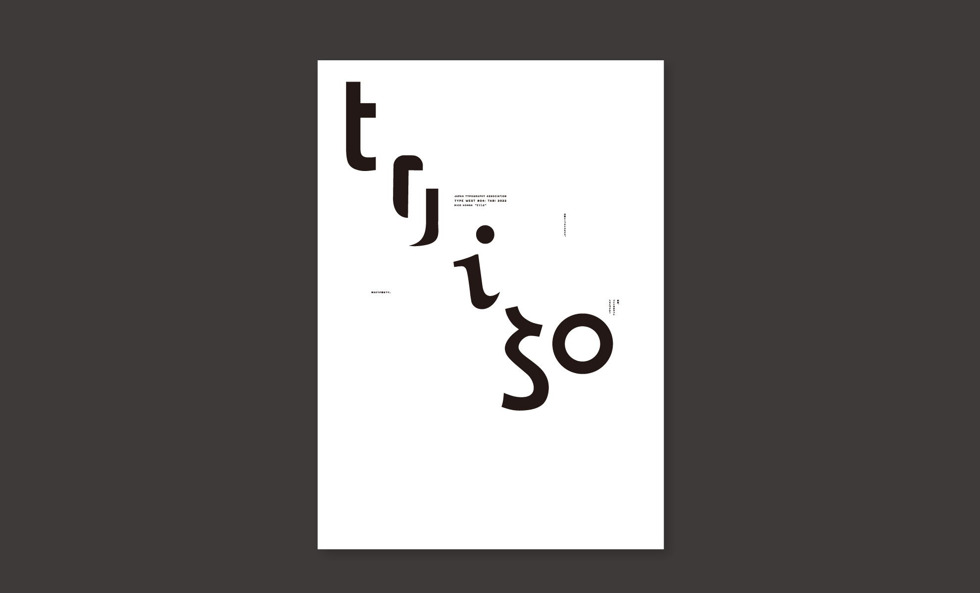
日本タイポグラフィ協会の西部研究委員会の企画展『TYPE WEST 旅』に私も参加いたしました。テーマは旅で、私は文字で作品を作りました。旅を意味する英単語は色々ありますが、trip(トリップ)の言葉の響きがとてもかわいいと感じました。英語でもひらがなでもカタカナでもかわいいので、全部を混ぜてもっとかわいい言葉を作ってみました。小さい頃に行った遠足を思い出して、スキップするような気分のポスターです。この企画展は、平和紙業の方がデザイナーの作品に合わせて紙を選ぶという実験的な一面があります。紙のプロフェッショナルが選んでくれたのは、ポルカという紙でした。ガサっとした風合いにカラフルなチリが入っているのが特徴の紙です。この紙を使用してもらったことで、懐かしい雰囲気がポスターに生まれました。仕上がりにとても満足しています。
This work was exhibited for the exhibition [TYPE WEST #4 Tabi 2022] held by the Western Research Committee of Japan Typography Association. The theme of this exhibition is 'Travel' and I designed the poster with typography. Although there are many words to describe 'Travel', among those words I found the sound of 'trip' sweet. The word 'trip' is made with letters which looks like as if they are skipping in the field. And surprisingly this happens in both Japanese Katakana, Hiragana letters and English alphabets. Therefore I mixed up all those letters together to create this sweet poster. The poster will remind you about skipping in your school trip when you were a child. This exhibition had an experimental element that a paper selector from Heiwa Paper company choose a particular paper for each designed works. The paper which was chosen for my work by the paper selector was called Polka. This paper had a characteristics of a rough texture and colorful dusts. Because this paper was chosen for my work, it created a nostalgic feel to the poster. I am satisfied with the finish of the work.