大岸正商店ポスター OGISHI-TADASHI-SHOTEN POSTER
- GRAPHIC

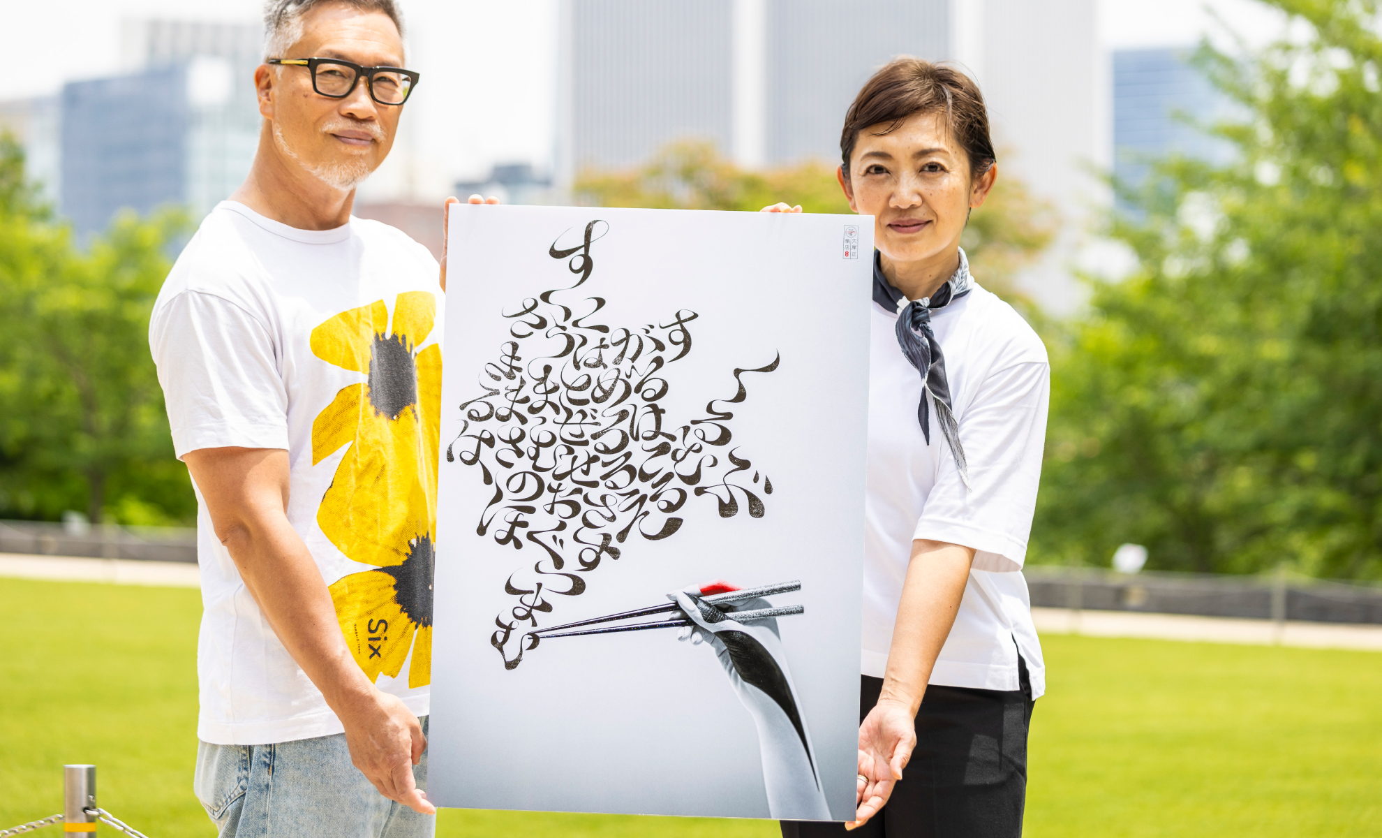
このポスターは国際コンペティションCIDEA DESIGN AWARD 2024において銀賞を受賞しました。
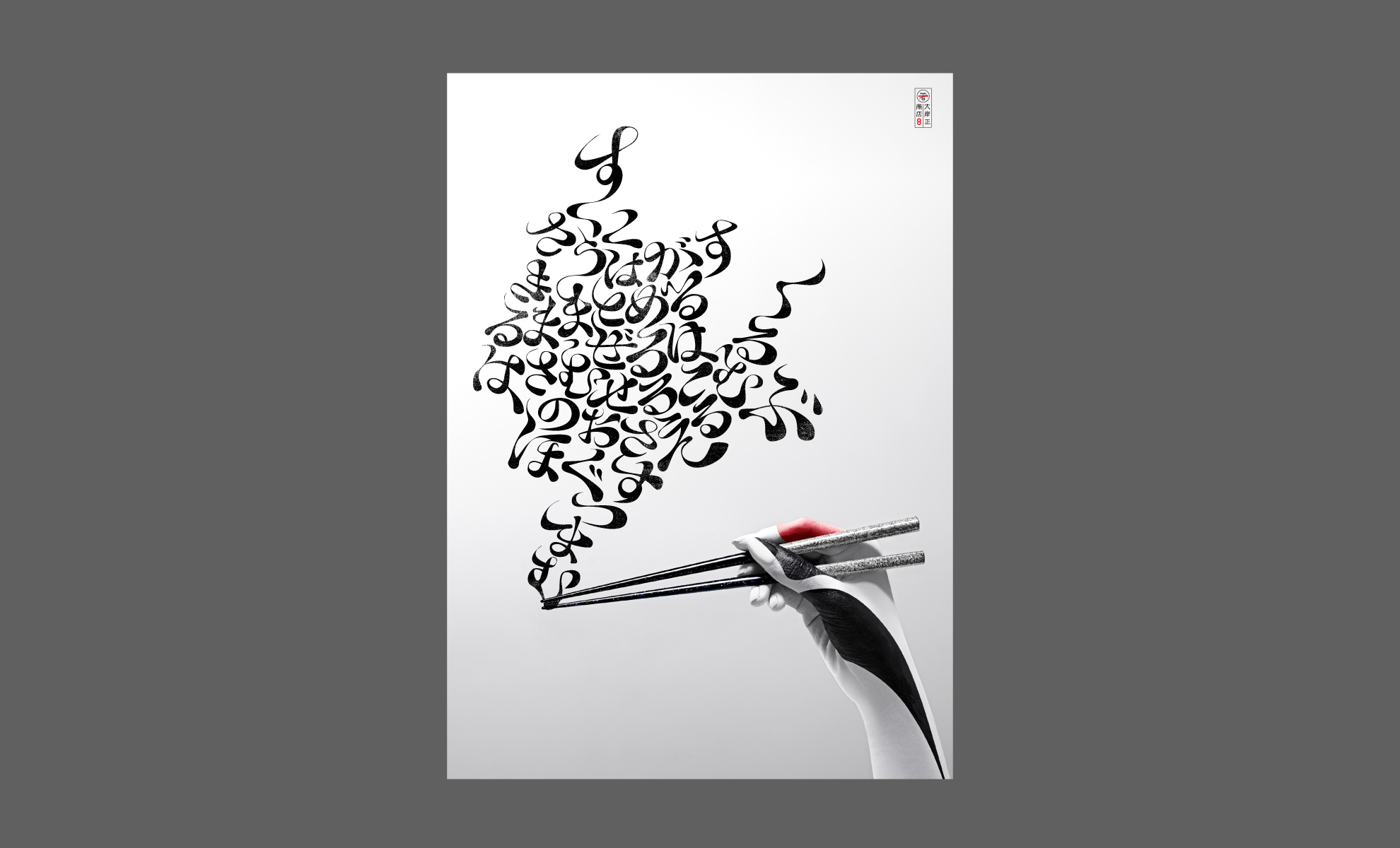
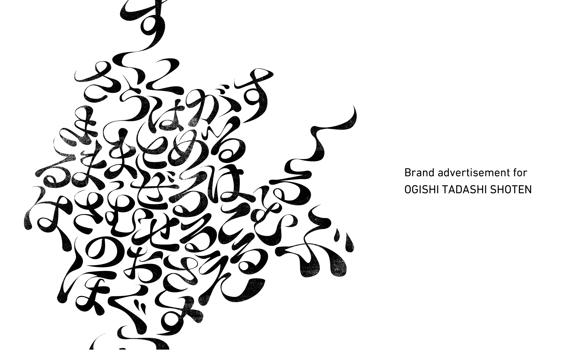
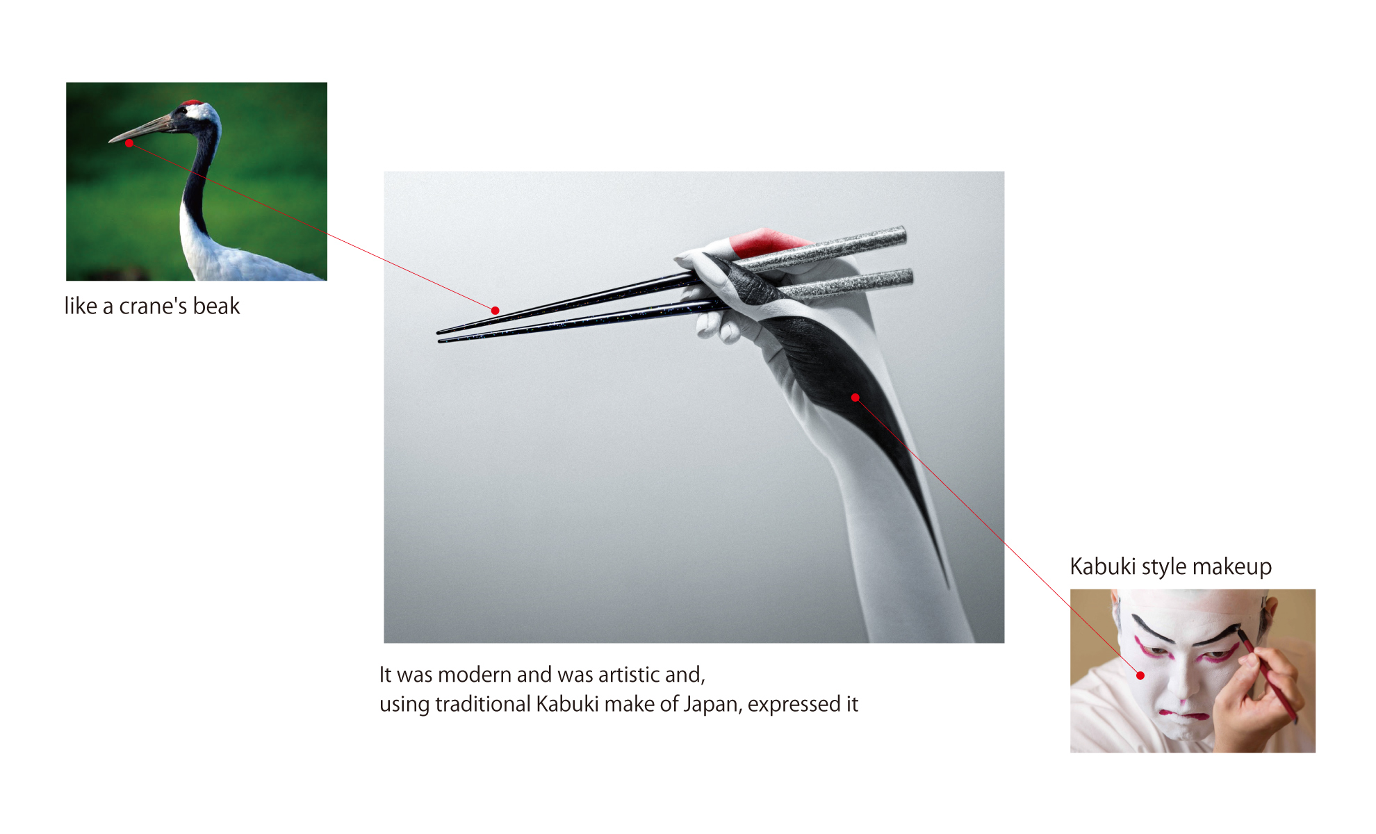
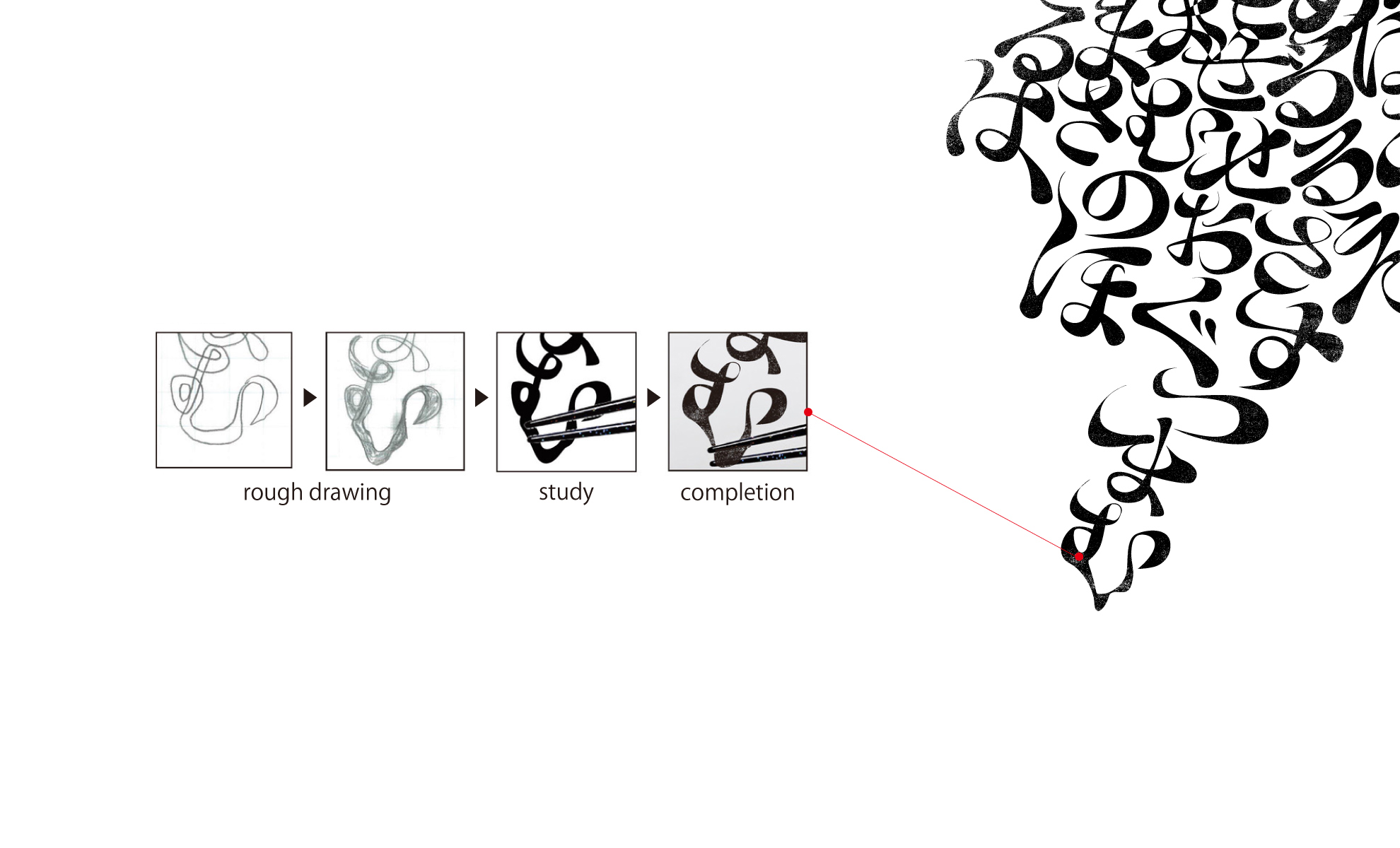
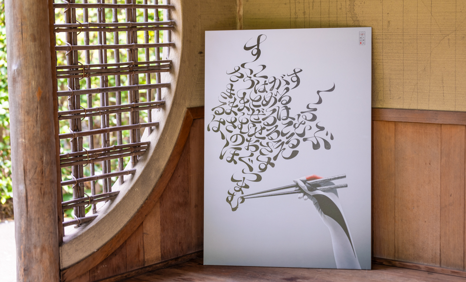
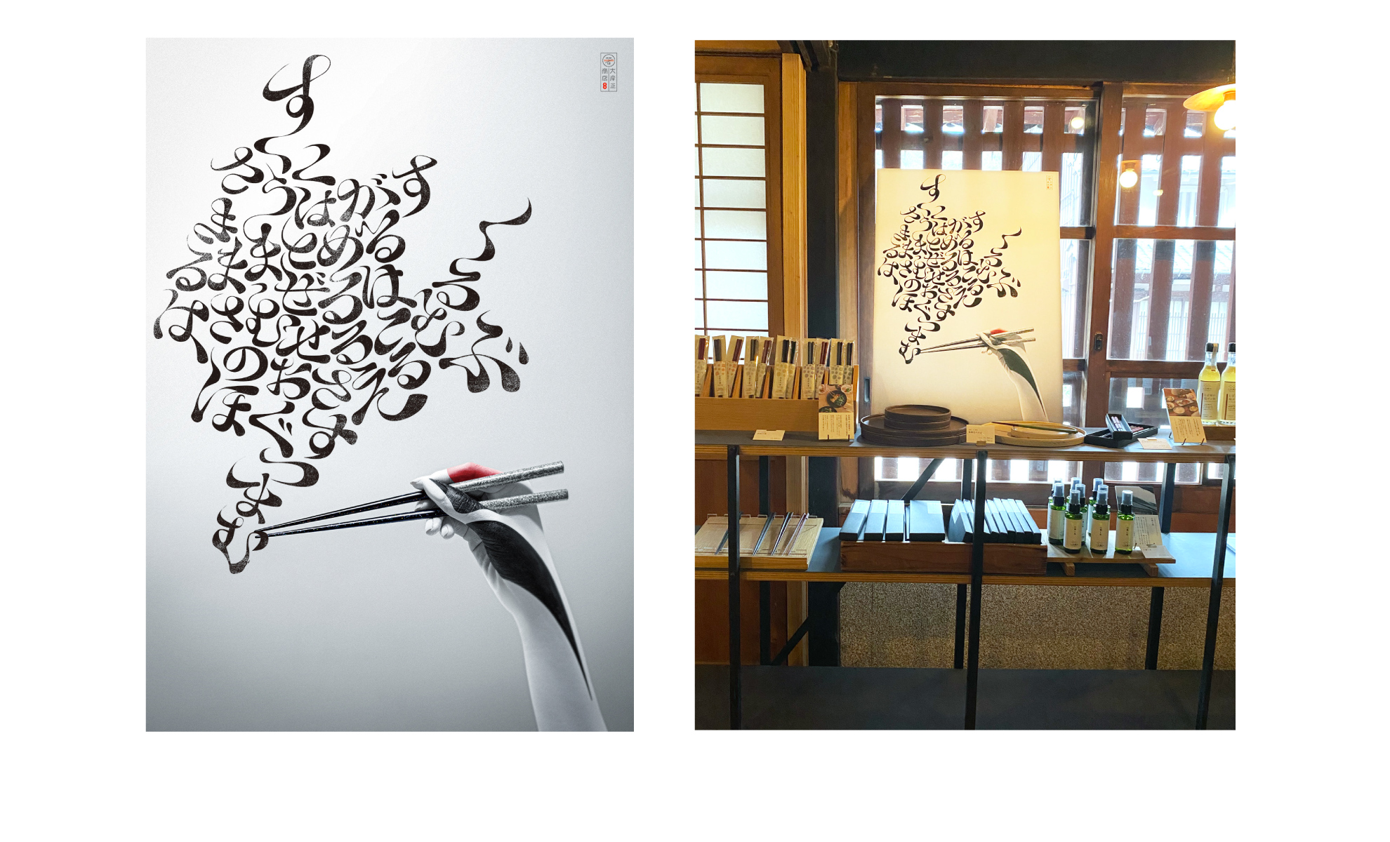
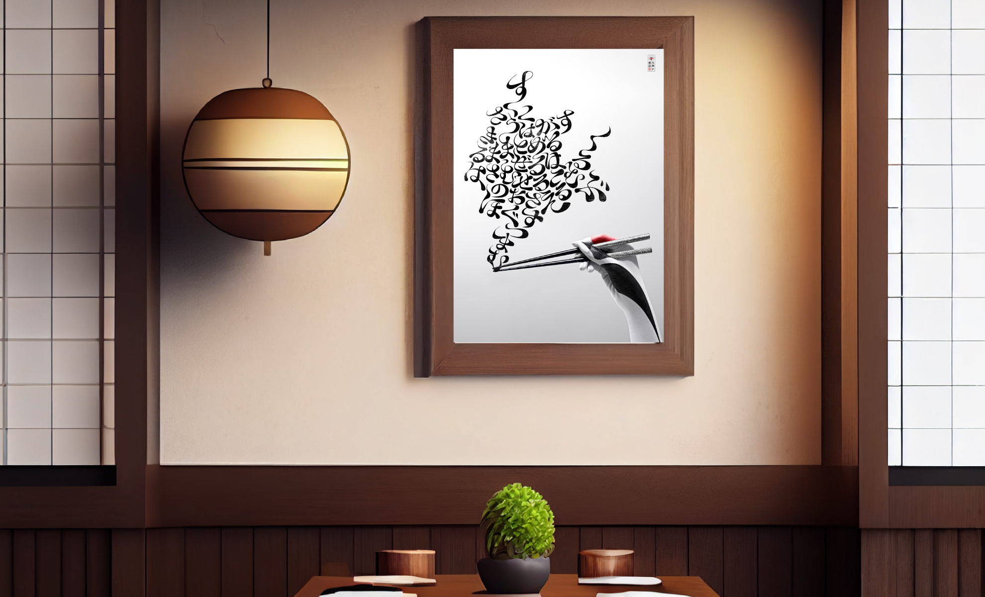
M.graphicsの森相さんと共同制作した大岸正商店さまのポスターです。「箸」という言葉の由来の一つは鳥のくちばしにあります。語源が示すように、箸はまるで人間の体の延長のように、正確に食べ物を扱うための食器です。この便利で豊かな食器の機能をこのポスターでは表現しています。鶴のくちばしのように見える仕掛けは、歌舞伎の化粧で表現されました。また、箸を刺したタイポグラフィには、「つまむ」「混ぜる」「すくう」などの言葉が含まれています。これらは、箸の九つの機能を表すひらがな文字です。
This poster won the Silver Award at the international competition CIDEA DESIGN AWARD 2024.
This is an advertisement poster for a Japanese chopstick store. One of the origins of the word "chopsticks" comes from the beak of a bird. As the etymology suggests, chopsticks are cutlery that can handle food with precision, as if they were an extension of the human body. This poster expresses the convenient and rich functionality of these utensils. The design, which resembles a crane's beak, is represented in Kabuki-style makeup. Additionally, the typography with chopsticks includes words such as "pinch," "mix," and "scoop." These are hiragana characters representing the nine functions of chopsticks.