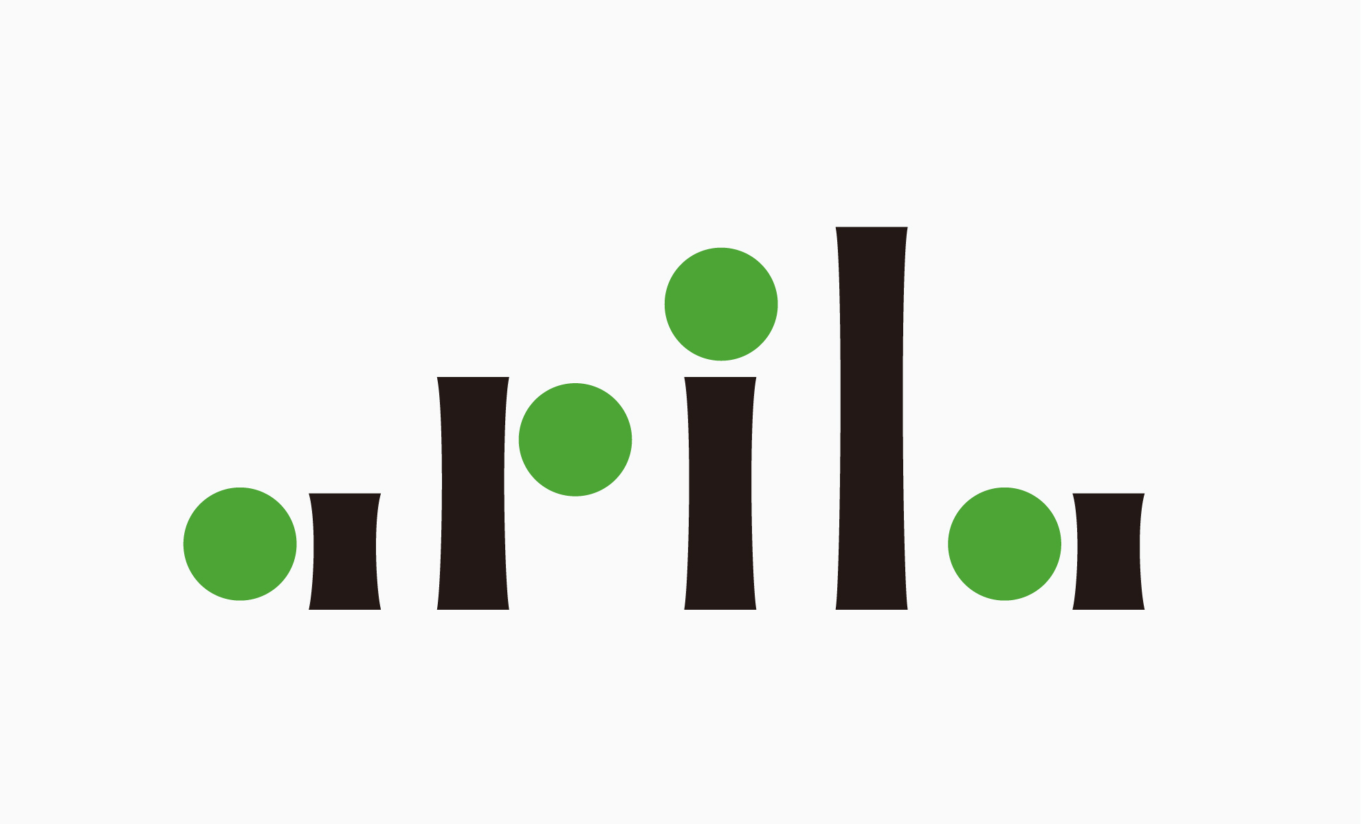
アピラ apila
- LOGO

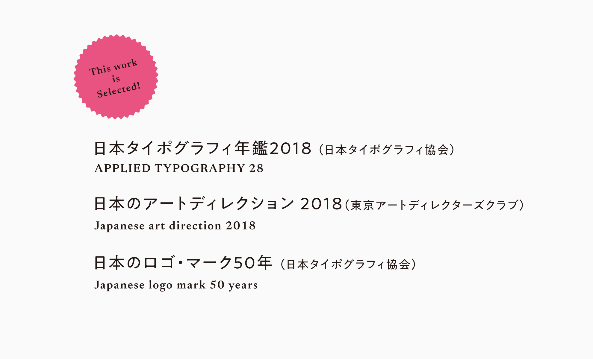
日本タイポグラフィ年鑑2018、日本のアートディレクション2018、日本のロゴ・マーク50年に入選しています。
Apiraは不動産会社です。フィンランド語でクローバーを意味する言葉であるApila。環境との共存を考えるこの会社のアイデンティティを、私たちは円とセリフのついた長方形のみで表現しました。グリーンの四つの丸は四葉のクローバーを意味し、希望を表しました。
cl:apila
This work was selected for «Art Direction Japan 2018», «Japan Typography Association 2018» and «Japan Logo Mark 50 years». "Apila" is an land agent. "Apila" means a clover in Finnish. The identity of this company is to concern for the environment. We created to it only use circles and rectangles on serif. It express "hope" by four circles as four leafs clover.