株式会社Wellink Wellink Inc
- LOGO
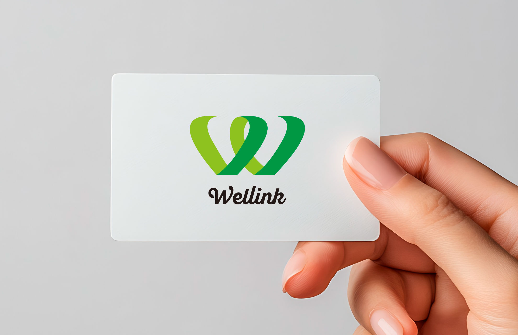
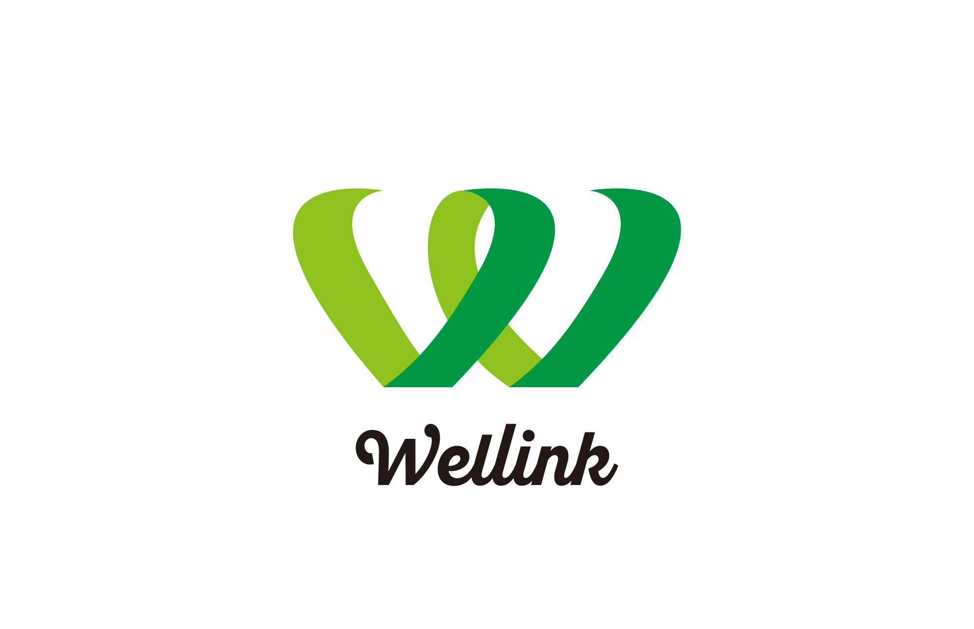
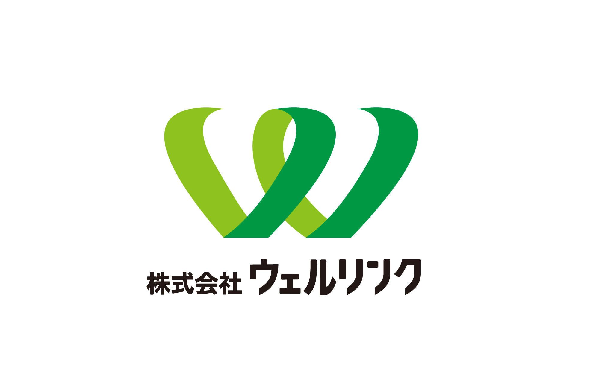
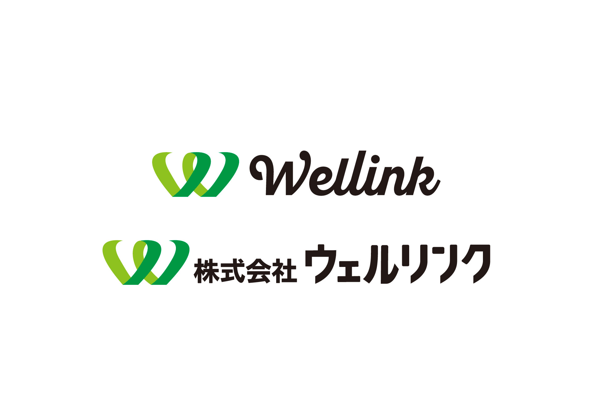
就労支援サービスを展開する「株式会社ウェルリンク」様のVI開発を担当いたしました。ロゴマークは、2本のリボンが交差するような「W」のかたちで構成されており、人と社会のつながり、そしてその広がり・発展を象徴しています。ブランド名の「Wellink」には、「Well(健やかに)」+「Link(つながる)」という想いが込められており、その価値観をロゴに込めてデザインしました。ロゴ開発を通じて、ブランドの核となるビジュアルを構築しています。
We were in charge of developing the visual identity (VI) for Wellink Inc., a company providing employment support services. The logo features a stylized W formed by two interlacing ribbons, symbolizing the connection between people and society, as well as the growth and expansion of those relationships. The brand name Wellink combines Well (well-being) and Link (connection), reflecting the company’s core values. These ideas are visually expressed through the logo design. Through the development of the logo, we aimed to build a strong and cohesive visual foundation for the brand.